티스토리 뷰
반응형
메가박스 사이트 만들기
동영상 보며 코딩하기 -메가박스 사이트 만들기
web's 동영상 바로가기
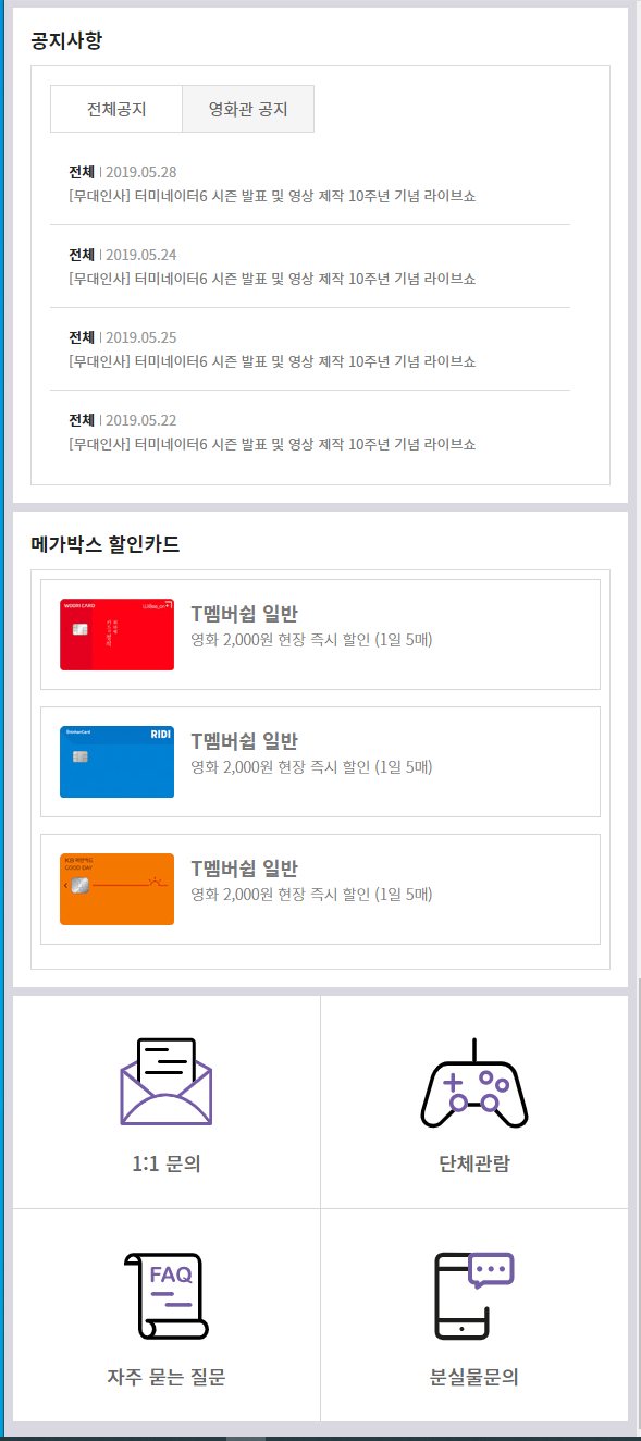
열여덟번째 강의 : 헬프영역 반응형
@media (max-width: 1024px){
    #mNav {display: block;}
    .nav {display: none}
    .row {padding: 0 24px;}
    .header h1 {float: none; text-align: center;}
    .header h1 strong {left: 24px;}

    .banner_menu .bm_left ul {display: none;}
    .banner_menu .bm_right ul:first-child {display: none;}

    .help article.help_box1 {width: 49%; margin-right: 2%;}
    .help article.help_box2 {width: 49%; margin-right: 0;}
    .help article.help_box3 {width: 100%; margin-top: 2%;}
    .help article {height: auto;}
    .service li {width: 25%; height: auto;}
    .service li:nth-child(1) {border-bottom: 1px solid #d7d7d7;}
    .service li:nth-child(2) {border-bottom: 1px solid #d7d7d7; border-right: 0;}
    .service li a strong {display: block; margin-bottom: 10%;}
}

@media (max-width: 768px){
	 #help .row {padding: 0 24px;}
    .help {padding-bottom: 24px;}
    .help article.help_box1 {padding: 24px; box-sizing: border-box; width: 100%; background: #fff; margin-right: 0; margin-top: 24px;}
    .help article.help_box2 {padding: 24px; box-sizing: border-box; width: 100%; background: #fff; margin-right: 0; margin-top: 24px;}
    .help article.help_box3 {width: 100%; background: #fff; margin-top: 0; margin-top: 24px;}
    .help article.help_box1 h3 {font-size: 24px; font-weight: 700; height: 27px; margin-bottom: 20px; padding-bottom: 10px;}
    .help article.help_box2 h3 {font-size: 24px; font-weight: 700; height: 27px; margin-bottom: 20px; padding-bottom: 10px;}
    .help article.help_box3 h3 {display: none;}
    .help article.help_box3 > div {height: auto;}
    .service li {border: 0;}
}

@media (max-width: 600px){
	#help .row {padding: 0 8px;}
    .help article.help_box1 {margin-top: 8px; padding: 16px;}
    .help article.help_box2 {margin-top: 8px; padding: 16px;}
    .help article.help_box3 {margin-top: 8px;}
    .help article.help_box1 h3 {font-size: 18px; margin-bottom: 0;}
    .help article.help_box2 h3 {font-size: 18px; margin-bottom: 0;}
    .card {padding: 8px;}
    .service li {width: 50%;}
    .service li:nth-child(1) {border-right: 1px solid #d7d7d7;}
    .service li:nth-child(3) {border-right: 1px solid #d7d7d7;}
}

@media (max-width: 320px){
    .movie_title li a {margin-right: 9px;}
    .notice {padding: 8px;}
    .notice ul li ul {left: 9px; top: 56px;}
    .notice ul li ul li {padding: 8px;}
    .notice ul li a {padding: 5px 10px;}
    .help article > div {height: 287px;}
    .card ul li {padding: 8px; margin-bottom: 8px; min-height: 90px;}
    .card ul li span {left: 11px; top: 10px;}
    .card ul li span img {width: 60px;}
    .card ul li strong {padding-left: 75px;}
    .card ul li em {padding-left: 75px;}
    .service li a span {width: 70px; height: 70px;}
    .service li a strong {font-size: 14px;}
}
평소 화면

max-width 1024일때

max-width 768일때

max-width 600일때
max-width 320일때

반응형


댓글
© 2019 Eun's